A journey through a terrible website: What can we learn?
.
Hello world, I’m disabled. When my disability prohibited me from working, I had to file a disability claim. My experience wasn’t remarkably bad until I stumbled into this question:
![Text input with prompt "If you are out for COVID-19 or Coronavirus,� [sic] please enter B97.29 in the response field; otherwise, please skip this question."](/_astro/2021-12-15-01-covid-question.VRWCdhOz_23anK1.webp)
As a web developer, this makes me sad.
Unfortunately most websites are designed poorly. They’re not accessible, they look rushed, things feel broken, and modals keep popping up to inform us about cookies. This is no secret. The real question is, “How can we make it better?” Let’s walk through a disability claim and see where things go wrong.
Prudential Financial is the Fortune 500 company that handles disability claims for Microsoft. Although it has the resources to create a smooth user experience, their development team (including engineers, designers, and program managers) has failed at nearly every turn.
Let’s begin our journey where all online journeys begin: Account creation.
Exhibit A: Password verification
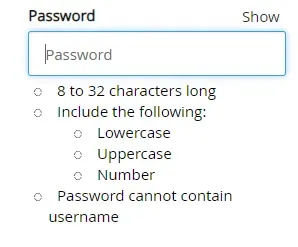
Here we have a standard “create new password” input. At first glance, the input seems to be implemented rather well. The general look and feel is clean, and the field is big enough to easily notice and click on. The password rules are clear, and there is a “Show” button. If you generate a random password with a password manager, you can paste it into the password field. What’s more, the bullets next to each rule are dynamic: they turn into red X’s or green check marks based on whether your input follows the rules. It seems really easy to tell whether your password is valid. “Create new password” came with its usual twin, the “confirm password” input, and that twin was implemented well enough.
Let’s choose a password: CorrectHorseBatteryStaple92%. We threw in a symbol because we wanted to feel special. After all, there’s no rule against it, right? All of the bullets turn into green check marks, so we confirm our password and try to move to the next screen.
Unfortunately, we’re met with this:
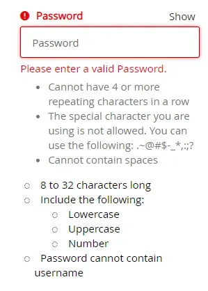
Oh, um, OK. I guess there were more rules? Why were we not informed of these rules? Because the team did a bad job, you say? Correct!
Somehow, some way, they managed to mess this up. They had gone above and beyond with the dynamic bullets, but they totally forgot to inform us of the valid symbols.
Yes, there are a lot of rules here, and it’s unlikely users would break these new rules. But they could have at least had a “Show all rules” button so we didn’t have to be unexpectedly punished after seeing a bunch of green check marks.
Can you spot the other two problems with this experience?
- Why is “Password” capitalized in “Please enter a valid Password”?
- This placeholder text is not helpful: it only increases chattiness of screen readers. It can also confuse users, because it looks like the field is filled at first glance. Placeholder text that is a duplicate of the label should be omitted because it provides no value.
This is a classic case of a team not testing its product thoroughly. Had the team members put themselves in our shoes, they would have immediately seen the issue and re-designed this experience.
Exhibit B: Misleading and ambiguous warnings or instructions
We’ve just gotten past the password form and created our account. What do we see when we log in for the first time?
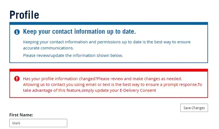
Ah. Wonderful. We’ve just created our new account and they’re providing us with both additional information and a red box with an exclamation point. That’s not alarming at all. I, for one, feel very welcome in this new system.
The first box wants us to update our contact info. We first entered (and reviewed) our contact info a few moments ago when we created our account. The info that the site is showing us below is a reprint of what we just sent to it. Why do we need to review it again?
The second box is where things get fun. They wanted to yell at us so much that they forgot to proofread. I count three missing spaces and one missing final punctuation.
Don’t forget the main issue here: The red box starts the same as the blue box above it, asking us to update our contact info. If we only read the first line, we might conclude the whole box is redundant, but it actually has another purpose: to inform us of e-Delivery! And what’s the best way to get our attention? A big red box and an exclamation point! Of course! If only they had a calmer, blue-r style with an “i” icon instead of an exclamation point they could use for this information box that does not indicate any errors or warnings.
Even better, they could have informed us of E-Delivery when we were first creating our account. Yes, that would’ve taken more development time. But it would’ve avoided this big red mess.
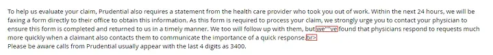
But we’re not done yet! Do you see that “Save Changes” button? I did! There were no changes to save because I had put in all the info moments earlier and reviewed my entries then. I pressed the button anyway because it was the only way to close the popup. And guess what I saw?
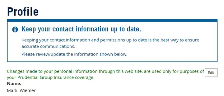
Again, the developers were so excited to give me this info that they forgot to proofread. They left in an extra comma and forgot the period at the end. Also, who writes “web site” as two words anymore?
They even formatted the text poorly. It’s butting right up against this new “Edit” button and sitting right on top of the text below it. But now I’m being picky. Let’s return to the main issue.
They forgot to clarify that when we clicked the “Save Changes” button, our changes were actually saved! Nowhere does it actually say, “Your changes were saved.” It’s just a poorly-formatted block of green text that gives us more unsolicited information. There is no indication for blind or colorblind users that the “Save Changes” button worked correctly. The only indication for most users is that the text is green, and this is not sufficient.
What’s worse is that this information would’ve been nice to have before I saved my changes! Even better, I could have been informed when I was first creating my account. My goodness, how did this mess get published? We haven’t even started to file a claim yet!
With so many errors so early in the process, evidence leads me to conclude that this team simply doesn’t have a comprehensive review structure in place. It doesn’t make sense to say “these mistakes slipped through the cracks.” The cracks of what? These mistakes were missed because the development team simply doesn’t value proofreading, clarity, or a good user experience.
Exhibit C: Overly-complicated question
After answering a few standard questions, we’re reminded that we are, indeed, living in the early 2020s. A question clearly written by a robot asks us:
If you are out for COVID-19 or Coronavirus,� please enter B97.29 in the response field; otherwise, please skip this question.
First and foremost, this should be a radio button. A simple yes-no “Are you out for COVID-19 or coronavirus?” It is simple to make the form send the text “B97.29” behind the scenes. No excuses here. This is the crown jewel of the question, easily. But there’s more.
That fun ”�” replacement character is always a good sign of a team that took its time and definitely didn’t rush a product to release. It indicates some bad HTML behind the scenes, but it’s not really a breaker to the question.
Finally, look at how long this text field is! It could support a few dozen characters, easily, but the developers knew the only valid answer was a simple 6-character field. This is already the work of a very sloppy team, but this is another level of sloppy.
At least they said please.
Closing arguments
Through mistakes like these, Prudential’s developers and program managers make it clear that they don’t care about user experience. Although they’re using modern technologies, they fail to put more than the bare minimum into their product. The result is an inaccessible mess for thousands of claimants every year. It also serves as an excellent case study in what often goes wrong with web development.
Unfortunately, Prudential is not alone here. Many password creation steps don’t inform the user of any rules. Plenty of sites have a lot of typos. Heck, I didn’t even get to complain about some annoying cookie notification, loud auto-playing videos, or ad-block pop-up. It’s clear that our standards for the web aren’t high enough.
There is no easy answer here. I would plead with developers to challenge bad design, but I know they’re under pressure to deliver a lot of features in a short amount of time. I would ask program managers to increase budget and extend timelines for projects, but that’s obviously easier said than done.
Ultimately, I recommend anyone with serious accountability for a project to look to Web Content Accessibility Guidelines (WCAG). WCAG serve as a well-researched, clear, and comprehensive guide to creating web experiences that are accessible and easy-to-use for everyone. Understand that following this guide will take time, but it will result in a vastly superior user experience that will immediately set you apart from the competition.
In short, we can’t make good web experiences if we don’t care about the user. Web frameworks or other tools will not solve this problem. Only through watching users interact with our website can we fully understand their pain points and design a usable product. The best we can do as a development team is follow WCAG and test our product thoroughly by mimicking the user’s experience in many scenarios. Developers themselves can test the site, but it’s best if others unfamiliar with the product use it as well. You may find many mistakes, but you’ll probably also find that they’re easy to fix.
It will take a lot of work to make this world wide web of ours more inclusive. I’m still searching for avenues that regular users can take to file complaints and call attention to significant issues. Expect much more to come!
2026-05-12: Fix formatting issue with WCAG link
See also Blog - markwiemer.com