Testing web accessibility: Reflow efficiently
.
Like all good engineers, we want our products to be accessible. Since we’re building a website (or a web app), we’re following Accessibility Insights for Web’s assessment. We’ve reached section 17.5: Reflow. This section ensures our website is accessible with a viewport of 320x256 CSS pixels (including scroll bars). Let’s learn how to test reflow efficiently.
Without special tools, testing reflow is a tedious process. If we follow Accessibility Insights’ recommendation and change our display resolution, we have to deal with all our apps resizing and our multi-monitor flows breaking (even on Windows 11). And with lower resolution, managing multiple tasks becomes more difficult. If we try to resize our window manually, we’re likely using guesswork as we slowly click and drag to change size. And if we keep 100% zoom, we’re likely to end up with a very tiny window. This tiny window may be difficult for engineers on our team (either now or in the future) to inspect. So we’ll need to zoom in, resize the window again, and repeat the tests. Ugh.
Wouldn’t it be nice if we could quickly jump to the correct viewport in just a few clicks? We can, with the help of the Web Developer extension by Chris Pederick. It takes some setup, but this article outlines how to get it working with Chrome, Edge, Firefox, or Opera at any display resolution and zoom level. It should work on any OS as well. It will even work with custom scaling settings, like increased text size or display scale. We want to jump to a viewport where visualViewport.width is 320 and visualViewport.height is 256 (assuming there are no scroll bars). Note we are not using window.innerWidth or window.innerHeight because those values round to the nearest whole number.
The setup takes a bit: We need to instruct the Web Developer extension to resize the window such that the viewport is 320x256. However, the extension only knows the window’s outer size (including UI like the address bar). Additionally, it can’t account for the browser’s zoom. We’ll have to follow these steps to get exact values for the window’s inner size, but we’ll only have to do this once!
- Open a new tab and go to
about:blank. - Resize the browser so it takes up about half of the screen. This can be a rough approximation. Make sure to set the browser zoom to 100% (default zoom).
- Open the browser’s console and undock it.
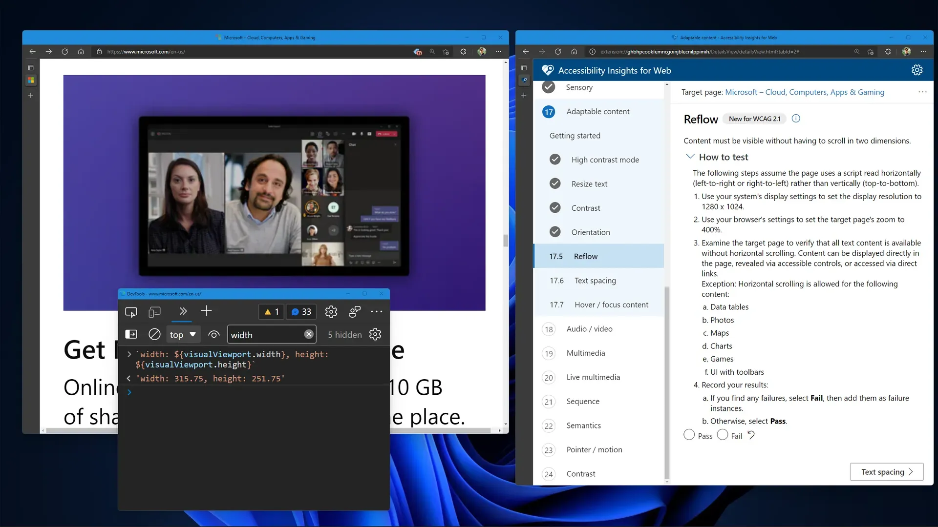
- Log the viewport size using this command:
`width: ${visualViewport.width}, height: ${visualViewport.height}`. - Use the “Edit Resize Dimensions…” button to create a new resize option in the Web Developer extension. This is found in the Resize menu. Set the dimensions to those that were logged in the previous step and save the new option with any name. If the logged dimensions are fractions, round down to the nearest whole number.
- Return to the blank browser tab and apply the new resize option. The browser should slightly change size.
- Zoom the browser until the visual viewport dimensions are about 320x256. This can also be a rough approximation. Do not resize the browser window. Save the zoom level you chose in the console. For example, if the zoom level is 250%, use the following command:
const zoom = 2.5. - Calculate the desired resize dimensions using this command in the console:
`desired width: ${ORIGINAL_WIDTH + (320 - visualViewport.width) * zoom}, desired height: ${ORIGINAL_HEIGHT + (256 - visualViewport.height) * zoom}`. ReplaceORIGINAL_WIDTHandORIGINAL_HEIGHTwith the resize dimensions you chose in step 5. - Edit the resize option from step 5 to use the desired resize dimensions from the previous step. Round to the nearest whole number.
- To confirm the changes work, return to the original tab and apply the updated resize option. Then, zoom to the desired level and log the viewport size using the command from step 4. It should be
width: 320, height: 256. If it’s slightly off, try adjusting the resize option by a few pixels. With some UI settings, it’s impossible to get exact values. Within 1 on either side should be fine, but note these values correspond to the CSS media queries for width and height.
Congratulations, we’re all set to test reflow now and into the future! We can transition from normal browser use to accessibility testing with a few simple clicks: Simply apply the resize option and zoom to the desired level. We can return to normal browsing at any time.
If our monitor doesn’t support both width: 320 and height: 256 simultaneously, we can test them independently. We can create two resize options, following the steps above, to do this.
Now we’ll never have to worry about reformatting our display for accessibility tests ever again!
See also Blog - markwiemer.com